Sunday 13 June 2010

Final Piece


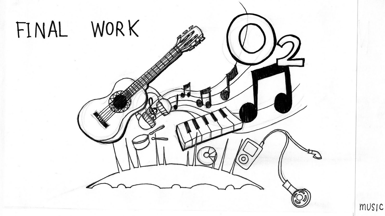
I want to bring out all of the icon that can represent music, family entertainment and sport in this 3 theme with simple illustration style.

My sketch


Some of my sketch up idea

Brainstrom idea


The brief is to create illustration one or both of the image above any style that you like to enliven the sky around our iconic landmark in 3 theme which is music, family entertainment and sport.

Micro project3_O2 Brief


I chose another brief from VCN to do as my micro project3.
This one is illustration brief which is out of my area of practice but I want to experiment myself more in another area that relate to my AOP.

Monster Munch_Final


This is the finish one after I add on gradient black filter. It look much more better with the tone.

Monster Munch_test


I test with the opening scene first and I think it's look a bit dull, not have a dark and monster feeling. So I want to add a gradient black filter that I like to use to make it more dark tone.

Saturday 12 June 2010

Animatic_Monster Munch


Animatics for Monster Munch. After I done storyboard, I test it but put it together in Animatics to see how it's work.

Storyboard


Storyboard for Monster Munch

Idea and Concept


This is some creative challenge from the brief.
My idea and concept is I want to create a short Motion Graphics promote
monster Munch by using a retro theme as original advert to follow there concept that they bring back the original size of crisps and monster to let the audience remember again. As you can see there is no more advert for monster munch recently, so I want to bring them back to promote again as the original style.
Visual style and concept base on Monster Munch history also visual graphics in official website as my work can be show up in there website.


Visual Style
Monster Munch Advert - 1986


The original advert that shown in 1986.
This give me an inspiration with there mood and tone really represent monster but mix with some gag the entertain people.

Case Study


Smiths Crisps Monster Munch 'dream' 1977 UK advert
They playing with the characters. They use a tree to represent flavours snack. The pink monster can eat all the crisps because he is the tallest but at the end it's just his dreaming. So other monster enjoy the real snack while he is still sleeping.
The concept is biggest snack pennies can buy, this show that they really produced a big pack of snack that worth for money to buy it.


1994 Advert for Monster Munch with free transfer & Computer game offer
A promoting advert to let everyone collect the colorful transfers or a fantastic computer game.

The idea is simple and easy to understand which is a good way to promote there product and promotion offer.

Target Audience


Students aged 18-24
Life style of college and working part time, sport, drinking, clubbing, sleeping. They tend to snack rather than eat regular meals.
From teenage audience with new technology in daily life. I want to create work can get attraction from them by using digital work. is the best way and convenience to get to them.
-Fun
-Out going
-Willing to try new stuff
-Surf web
-iPhone
-1980s-1990s kids
-maybe used to have Monster Munch when they were kids

Quotes from target audiences
"Finally found some roast beef flavour in WHSmith, B'ham New St station. They were on a special promotion stand with 'bigger like they used to be' at the top. 75p a bag though which is a complete rip off!"
"The packaging is fantastic, the monster munch are indeed bigger but not quite as big as I'd hoped."
"I can't believe it beef monster munch back on sale big bag too. I felt like a kid in a toy shop."
"I think they should bring the becon ones back. They were the best and the monster was so cute!"

Flavours


Flaming Hot
Roast Beef
Pickled Onion
Retro pack design featuring ever-popular Monster characters. Old design, back to the bigger bag with bigger crisps. In each flavours they use a different character to make the different identity. The Monster is big as an icon that show simple but attractive colors and style, stand out and easy to remember and appeal to the consumer.

Visual Research

Monster Munch official website
http://www.megamonstermunch.com/main.html


The official website shows facts and also have a poster, interactive game, screensaver to download. Now they got a new promotion for fans to get a retro Monster Munch T-shirt available on website only!


This is what they want to promote to be the same as they use to be. Reintroduction of bigger pieces as originally.

History


A short- lived range of Monster Munch theme drinks 'Monster Fizz' was available in the 1980s. The small range of flavours included orangeade.
'Monster Munch Tall Stories' from Smiths Crisps during 1980s for the member of Monster Munch Club. This included six ' Tall Stories' and accompanying songs.

Original Monster Munch relaunched (2008-

In September 2008 Walkers introduced a Mega Monster Munch range based on the original Monster Munch from the Smiths days. The flavours are 'Pickled Onion', 'Roast Beef' and 'Flamin' Hot'. The crisps returned to their original larger size. The packs include retro designs, based on the original packs, featuring three of the original four monsters. 'Roast Beef' flavour features the Pink Monster as originally, 'Pickled Onion' features the Yellow Monster and 'Flamin' Hot' is marketed with the Blue Monster.

Due to the popularity of this new range, it has replaced the previous range and is now the only range of Monster Munch available to buy.

A Mega Monster Munch website was launched to coincide with the relaunch

History and Research

Walkers Monster Munch (1995-)

In 1995 the Monster Munch brand was taken over by Walkers who relaunched the brand in a range of four flavours. One of the most significant changes was that the crisps were much smaller in size than they used to be. The monster characters were also completely redesigned.

Flavours

Walkers relaunched Monster Munch with four flavours: 'Pickled Onion', 'Beef Burger', 'Spaghetti Sauce' and 'Flamin' Hot'. Since the relaunch the range of flavours changed several times, with 'Cheesy' replacing 'Spaghetti Sauce' (and the Blue Monster being recoloured yellow) for example. A controversial 'Vanilla Ice Cream' flavour of Monster Munch was launched in 2004 as a limited edition, and was received with mixed reaction. This type of Monster Munch was non-savoury, and contained sugar instead of salt.

In February 2007 Monster Munch were re-launched in new packaging to coincide with the new usage of SunSeed oil in their ingredients.

New monsters


History and Research


a corn snack available in the UK, Republic of Ireland and France which is produced by Prime Enterprises trading as Walkers. Although the snack is largely aimed at children, the snack is enjoyed widely by people of all ages. Walkers Pickled Onion Monster Munch is the company's 9th best-selling snack.


Smiths Monster Munch (1977-1995)

Monster Munch was launched in Britain in 1977, originally produced by Smiths. Originally called "The Prime Monster" (in reference to the brand producer, and as part of a wider campaign), the decision was taken to rename the snack "Monster Munch" in 1978. Advertised as 'The Biggest Snack Pennies Can Buy' (referring to the then-relatively-large size of the crisps), each pack featured a different monster on the front of the packet. There was even a "Monster Munch Club" available at some point during the period where Smiths owned the snack food. Members of the club received a "Monster Munch Munchers" membership pack, which included a membership card, pen, several story books, and a story tape which included six "tall stories" and accompanying songs.

Original monsters

There was an original sextet of monsters who would advertise the snack, however there were four main monsters featured on the packaging. These monsters came back on Monster Munch packets in 2009.

Monster Description Flavour
Pink Monster A tall, pink, gangly creature with a floppy tongue Roast Beef
Blue Monster A behatted blue creature with floppy-ears and four arms Smokey Bacon
Yellow Monster A yellow, one-eyed creature with a red nose Saucy
Orange Monster A fat, orange creature with pink hair Pickled Onion

Flavours

Monster Munch was originally available throughout the Smith's ownership in a variety of flavours over the years including Roast Beef, Pickled Onion, Saucy Tomato, Bacon, Cheese & Onion, King Prawn and Salt & Vinegar. 'Pickled Onion' has remained in the selection throughout the years, with 'Roast Beef' appearing in almost every combination. By the '90s there were four main flavours available: 'Pickled Onion', 'Roast Beef', 'Smokey Bacon' and 'Saucy'.


The original Monster Munch used two different snack shapes: these related to two of the Monsters used in the advertisements. The shape known as a 'monster paw' that is still used today is based on the eye of the cycloptic yellow monster, with the 'toes' representing the eyelashes. There was also another shape representing the gangly, long-tongued pink monster: this was circular with two bumps on the top for eyes, protrusions on either side and a tongue dangling down. For a limited time in the early 90s, there were also spider shaped Monster Munch in a smokey bacon flavour.

A short-lived range of Monster Munch themed drinks - Monster Fizz - was available in the 1980s. The small range of flavours included orangeade.

Micro project2_ Monster Munch brief

I choose Monster Munch brief as my 2nd micro project.
This brief is from YCN student awards.

Doritos_final


Finally after I changing again for a several time and I test to a few of my friends for all of my experiment. I think this version is the one I like the most and suitable for my visual.

Doritos_test3


After I changed the background color at the end to be white color and try to change a new soundtrack to make it look better. For this one I think the song is a bit too chilling and too slow can't follow my visual.

Doritos_test2


In this one I add on audio as a soundtrack to support my visual more interesting.
After render and test it, I found that this soundtrack not match with my visual graphics as well.
One more thing is at the end I use black background and that make the outline of Doritos logo fade out so I want to change it.

Doritos_test1


This is the finish visual graphics.
I test it with the sound effect again to make sure that it still keep the visual graphics follow sound effect as same as the Animatic one.

Animatic


After I done the storyboard, I test with Animatic first to see how the length going to be and did it fit in each scene or not. I add on some sound effect to test and support the visual

Friday 11 June 2010

Storyboard


Explore Doritos's flavours in 4 theme connected

Visual Style


The Magnet : Frito-Lay, Made for each other
This is one of the animation advertising campaign from " made for each other " by Frito-Lay.
Sweet little ditty is by Katie Herzig and called "Two Hearts are Better Than One"

I like the visual style and technique that they did a transition with color changing to be another scene, this can develop and inspire me to do my work.

Visual Research


I have research visual that can use into my idea, explore the flavours using a metaphor. The object that can represent each flavours.


Visual Graphics
I have done for my animation work after developed from the research.

Thursday 10 June 2010

Flavours and Color tone


This are the flavours that I chose and the color, mood and tone to use for background color. I have define out a tone of color in each flavours.
Blue tone for Cool original
Yellow tone for Lightly salt
Orange tone for Tango cheese
Red tone for Chilli heatwave

Wednesday 9 June 2010

Case Study

Metaphor. I try to developed a metaphor technique to apply in my work


The metaphor in this ad is simple; having unprotected and/or unsafe sex is like inviting a poisonous insect in your bed. Although disgusting, it’s effective and makes one cringe.

A metaphor is a figure of speech that suggests a resemblance or emphasizes a point but is not a literal example.
Metaphors in art or in advertising can convey something in pictures that otherwise couldn’t be stressed enough with words. Like the picture of the spider- it speaks volumes more than a picture of two (human) people with a caption that says, “we contracted an STD from one another.”

My sketch idea


My idea is to explore the flavours using Metaphor to compare 2 different things
-graphics illustration in each flavours
-introducing all the most 4 popular flavour that i have chosen


Sandra is her office and takes a sip of her Tango Clear, and is promptly soaked through. Her boss knocks on her door to talk about "this", and when we see what he is talking about there are couple of men fanning her with Palm Tree leaves and another man soaking her with a hosepipe. She explains to her boss that they are a metaphor, and while he is confused by the analogy a colleague compliments Sandra on her metaphor, the boss leaves looking confused at the penguin slapping Sandra with a branch.
Very good example of Metaphor because it's very clear and easy to understand.

Tuesday 8 June 2010


Little bright eyes. Part of the cute animation "Made for each other" campaign for Chips and Dips by Frito-Lay. This is about little eyes can't see anything clear until he found a glasses that follow there concept which is made for each other


Tostitos Salsa Dips
Very nice and smooth animation show about the process of making a salsa dips. They use a female character to represent beauty of Mexican style.

Visual Research


Doritos Tribe : ad winner for 2008 "You make it, We play it" competition
A man arrives home with a delicious bag of Doritos, plonking them on the table he leaves to tend to something else. Whilst away a tribe of Doritos escape from the packet to perform a quick sacrifice to the God of Salsa. the man returns interupting the ceremony, opening the pot of salsa he is confused to find a dorito already inside. Deciding his love for doritos outwieghs his suspicion the man devours the doritos. The Salsa God is appeased.
I interested in technique that they did. They use Stop Motion and make it as an animation which is look more interesting than taking a video

Monday 7 June 2010

Target Audience


Young people who love to socialize
I want to make fun in my work for young people target that around same age as me. I have to convince them about how cool is Doritos, sharing a good time with them by express as interesting idea about flavours. To socialize can be
- Funny
-Make new friends
-Enjoy party
-Sharing good time
-Outgoing and having fun

Visual research


Print Advertising for Doritos USA
-They create an object that using Doritos crisps to represent power and strong as the concept identity "power snack"


-Poster to promote new flavours of Doritos, you can add a flavours shot powder to make it more tasty. Nice idea and the way they choose to create character for represent flavours shot is very clear. Color and tone also make it look more interesting.

Case Study

The winner of Doritos Crash the Super Bowl 2010 USA


This advert is very funny with the story. They play the gag by using a dog to stealing Doritos from a guy that try to teasing him.


This one play with a gag too. The idea is good by they try to compare same precious thing the the kid's mother and the Doritos

Sunday 6 June 2010

Micro project 1-Doritos Brief

I choose Doritos brief from D&AD student competition brief to do as my micro project 1


Doritos flavours


The most popular flavours that available in UK and dips for a better tastes